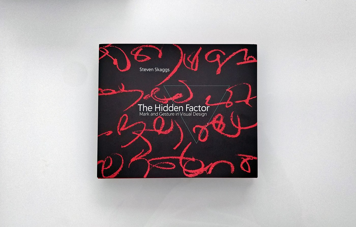
A new book by Steven Skaggs dropped through the letterbox, titled The Hidden Factor: Mark and Gesture in Visual Design (2023). It’s by no means logo-focused, but that’s good, because logos are, after all, pieced together using the same marks that make up all our visual surroundings, and it’s useful to step back once in a while and recognise that.
From the preface, “Artists usually think of their work as the making of an image; graphic designers think of design as communication through image and type. This book suggests that there is a third, hidden, factor at play in every visual work and image: the mark. When they are isolated by themselves, independent of pictures or words, we notice them, but when the three ingredients are combined, marks have a funny way of disappearing from our awareness.”
Steven kindly let me share the first of the book’s nine sections with you (excerpted below).
There is no visual entity without an edge.
We begin to see two edges, and when we do we begin to perceive one black line.
Those of us in the West see this line as “moving” from left to right. In Eastern cultures, people may see this line travelling from right to left. (But then they may have started reading this book from the other direction too!) If we see it moving from left to right, we see it diminishing, but if we see it moving from right to left, it seems to get thicker.
As the line gets thinner it eventually disappears. This place is called the “threshold of resolution.” The threshold is not a place that can be objectively pinpointed. In each viewing situation, the threshold will depend on a convergence of particular conditions, such as the precision of the reproduction process, viewing distance from the page, level of illumination, and a viewer’s eyesight.
Our ability to see a line is also affected by the kind of edge it has. If the smooth bottom edge is replaced with this jagged edge it becomes difficult to see it as a single black line. Now we start to see white objects sitting atop a black surface.
When the edges of the black form are in harmony, they reinforce directionality. Just as our ears hear two tones being “in tune,” our eye senses this harmonic relationship, and we are more likely to see the shape as a segment of a single line. We also sense a midline, or backbone, of the directional pathway.
(The graphic devices on these pages suffer discontinuities that are unavoidable in the making of a book. While our vision compensates for the slight bend of the paper, the breaking of continuity at the spine, where the book’s pages are bound together, is more disrupting.)
Meanwhile, although we’ve added just one more edge, this page looks much more complex than the preceding page. And it remains ambiguous as we struggle to settle on a single holistic object. Is this a white page with a black diagonal wedge above a curved black shape below? Or is it a white shape on a black background with a little bit of a white area “left over” at the top left?
Cropping and scaling can introduce another kind of ambiguity. Cut out a tiny portion of a gently curved shape, and the cropped edge suddenly loses its sense of curving and appears to be straight. The cropping drastically changes a visual form’s character, but as long as we retain an edge, visual form itself never goes away.
So different from language, where even slight cropping (editing) may drastically change the character of what is said, while a severe level of contraction not only changes the content but eventually eradicates verbal communication itself.
When edges conform and a line has harmony, with negative space clearly apportioned, the resulting figure appears somehow natural and whole. Why should it be so? It has been more than a century since such habits of perception were identified by psychologists Max Wertheimer, Kurt Koffka, and Wolfgang Köhler, and this is still one of the mysteries of consciousness. Certain visual tendencies that lead to wholeness and harmony are known as gestalt principles of perception.
This is certainly seen as a rectangular shape. This is just as surely seen as a short line. But do we see a black rectangle containing a white line? Black rectangle with a gap and then a black line? Two black rectangular shapes?
Dynamism also plays a part, and whether something exits a frame such as a page of a book, or contains something else (like this text) within.
Ultimately, there is no clear distinction between line and shape — the terms simply serve as rough descriptions of the appearance of visual objects. Calling something shape or line is merely a way of pointing to features of its form. Formalism is at the heart of the traditional “principles of art.”
“Skaggs explains the quotidian process of creating letters and images in the most enticing and inspiring ways. It is a must read primer for neophyte and veteran mark makers.”
— Steven Heller
“Steven Skaggs unearths the tactile joy buried in the formalizations of design. Bodies in motion make tangible marks on materials. Typefaces, logos, images, and patterns freeze gestures into crisp, coherent signifiers. Use this book to experience the haptic origins of communication.”
— Ellen Lupton
Quick mention for the minimal cover design that’s hidden behind the dust jacket (below).
Published by MIT Press, The Hidden Factor can also be picked up on Amazon.com, Amazon.co.uk.
Previously featured is one of Steven’s earlier books, FireSigns.


Leave a Reply